

What is Flexbox?
It is a way of aligning your elements in a container in a more systematic way, it helps to fit your divisions in a container with proper space, and alignment.
It provides you with the same functionality provided by positioning property but in more simplified and straightforward way. Remember flexbox properties are mostly first applied to outer div
So let's start the journey of learning CSS.
Normal layout of div

now just assigning display = flex will align the items side by side change the alignmemt of items on main axis on the main container div
  .container {
    display: flex;
  }

flex-direction
The flex-direction property specifies how flex items are placed in the flex container, by setting the direction of the flex container’s main axis. This determines the direction in which flex items are laid out.
flex-direction: row; (default value) - lays out item from left to right
flex-direction: row-reverse -lays out item from right to left side in main axis
flex-direction: column -lays out flex item in column wise thus changing the main axis and its properties
flex-direction: column-reverse;
Example
      .container {
        display: flex;
        flex-direction: column;
      }

justify-content
The justify-content property aligns flex items along the main axis of the current line of the flex container. This is done after any flexible lengths and any auto margins have been resolved. Typically it helps distribute extra free space leftover when either all the flex items on a line are inflexible, or are flexible but have reached their maximum size. It also exerts some control over the alignment of items when they overflow the line.
        .container{
        justify-content:flex-start;
        justify-content:center;
        justify-content:flex-end;
        }
justify-content:flex-start(default)
justify-content:flex-end

justify-content:space-between

align-items
This applies to individual items div's inside the main flex container.Flex items can be aligned in the cross axis of the current line of the flex container, similar to justify-content but in the perpendicular direction. align-items sets the default alignment for all of the flex container’s items, including anonymous flex items. align-self allows this default alignment to be overridden for individual flex items. (For anonymous flex items, align-self always matches the value of align-items on their associated flex container.)
align-items:flex-end

Code Snippet

      align-items: stretch;
      align-items: flex-start;
      align-items: flex-end;
      align-items: center;
      align-items: baseline;
      align-items: auto;
order
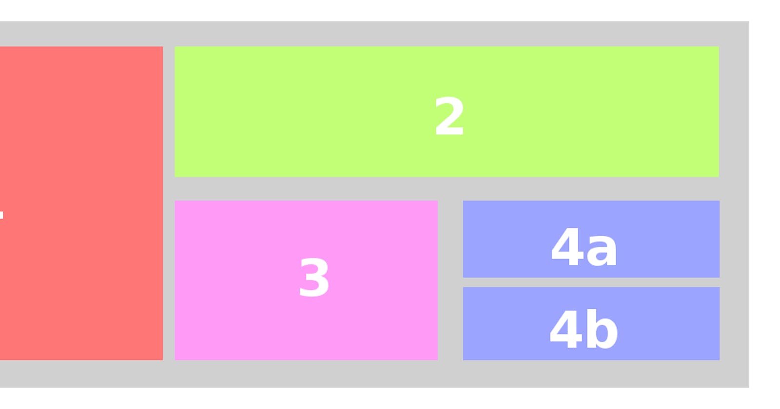
order property is used to arrange items in main axis but changes the order in which they are displayed according to priority of items. The items are then placed in the visual order according to that integer, lowest values first. If more than one item has the same integer value, then within that group the items are laid out as per source order


Code snippet

align-content
The CSS align-content property sets the distribution of space between and around content items along a flexbox's cross-axis
flex-wrap
The flex-wrap property controls whether the flex container is single-line or multi-line, and the direction of the cross-axis, which determines the direction new lines are stacked in.
      .container {
        display: flex;
        flex-wrap: wrap;

      }

Hope this Helps